Aulart - Online educational platform
Aulart is an online music education platform helping you become a better producer and musician through Masterclasses & online Bootcamps, featuring world-renowned music producers and industry leaders as your instructors.
Agency
DigitUp Studio
Role
UX/UI Designer
Year
2022
Team setup
From Aulart: founders (2) + designer + development lead.
UX/UI Designer (myself).
Deliverables
Heuristic evaluation.
High fidelity design file for desktop and mobile.
Documentation for development.
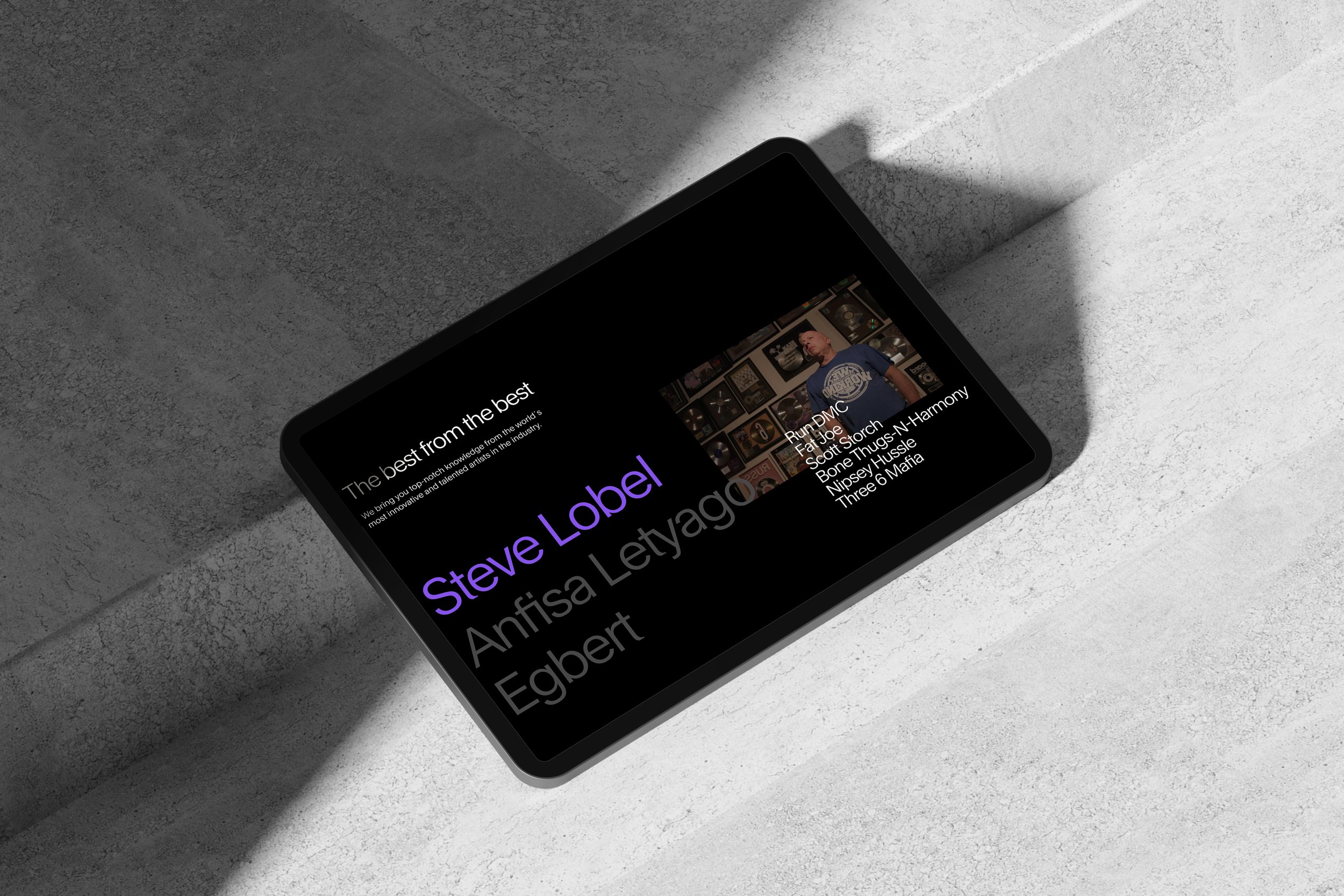
Preview of the final result
The challenge—
User feedback indicated that the product's targeted user experience level wasn't well understood. Users navigated the page without defining a specific action. Furthermore, membership generated confusion regarding what each plan included and how to pay. Our challenge was to achieve a clear and concise storytelling, where the product description is clear and easy to understand.
Empathize—Research Users' Needs
The first step was to organise the work sessions, explaining our process to the client in order to establish the phases and the need for close collaboration to address the problems identified.
Based on the metrics obtained from the client and user feedback, we created a system in which we heuristically analyse the website and the membership product. For each spot where we detect a paint point, we associate one or more heuristics to technically understand the reason for the user's frustration. To reinforce the concept, we rely on examples of other products that solve the same problem more efficiently.
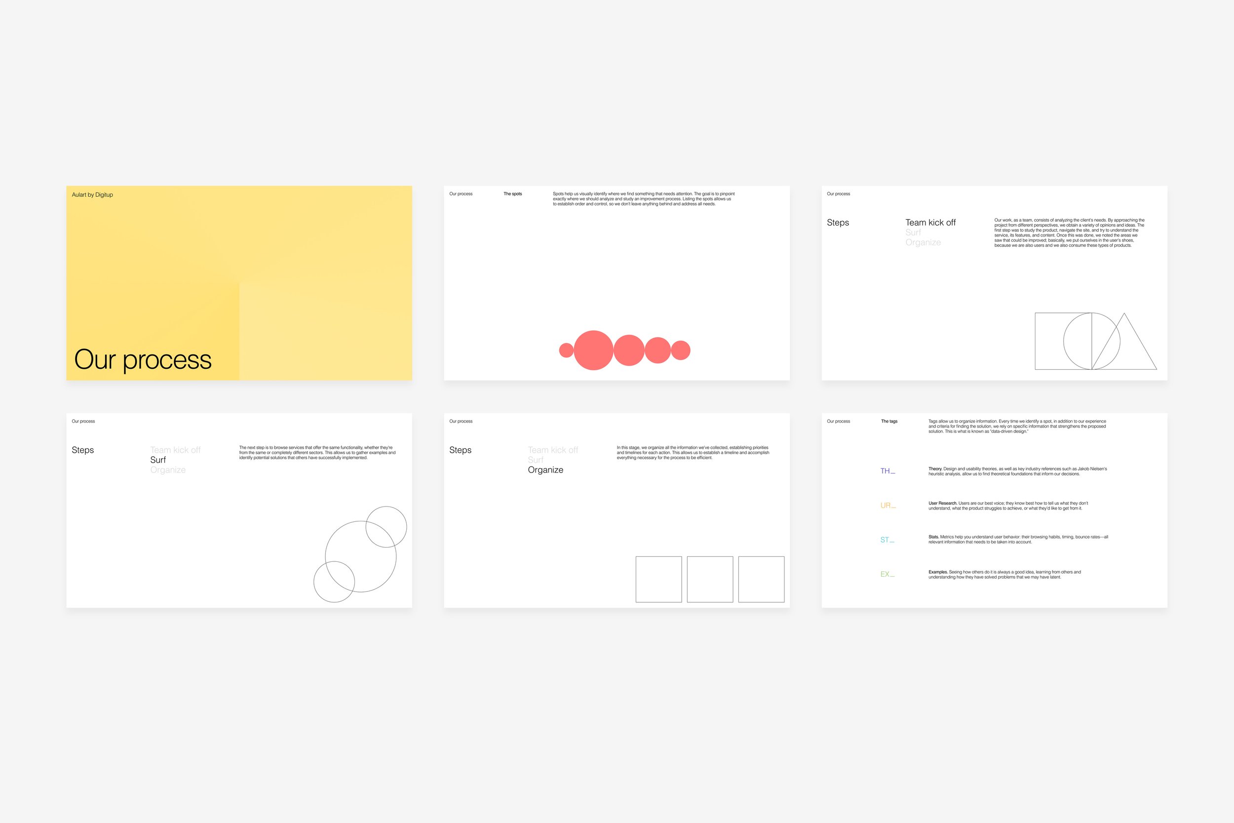
Process explanation
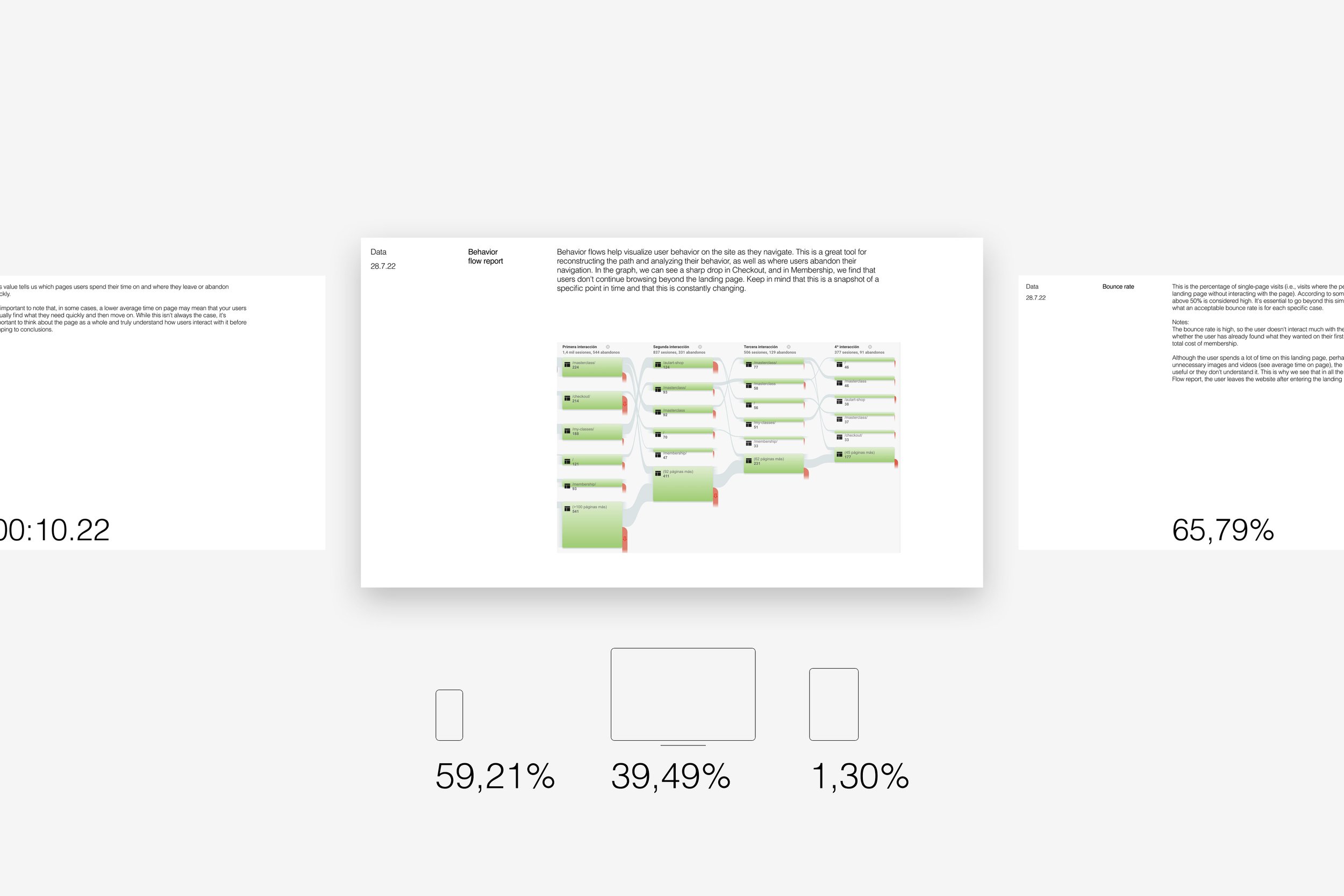
Quantitative and qualitative data analysis
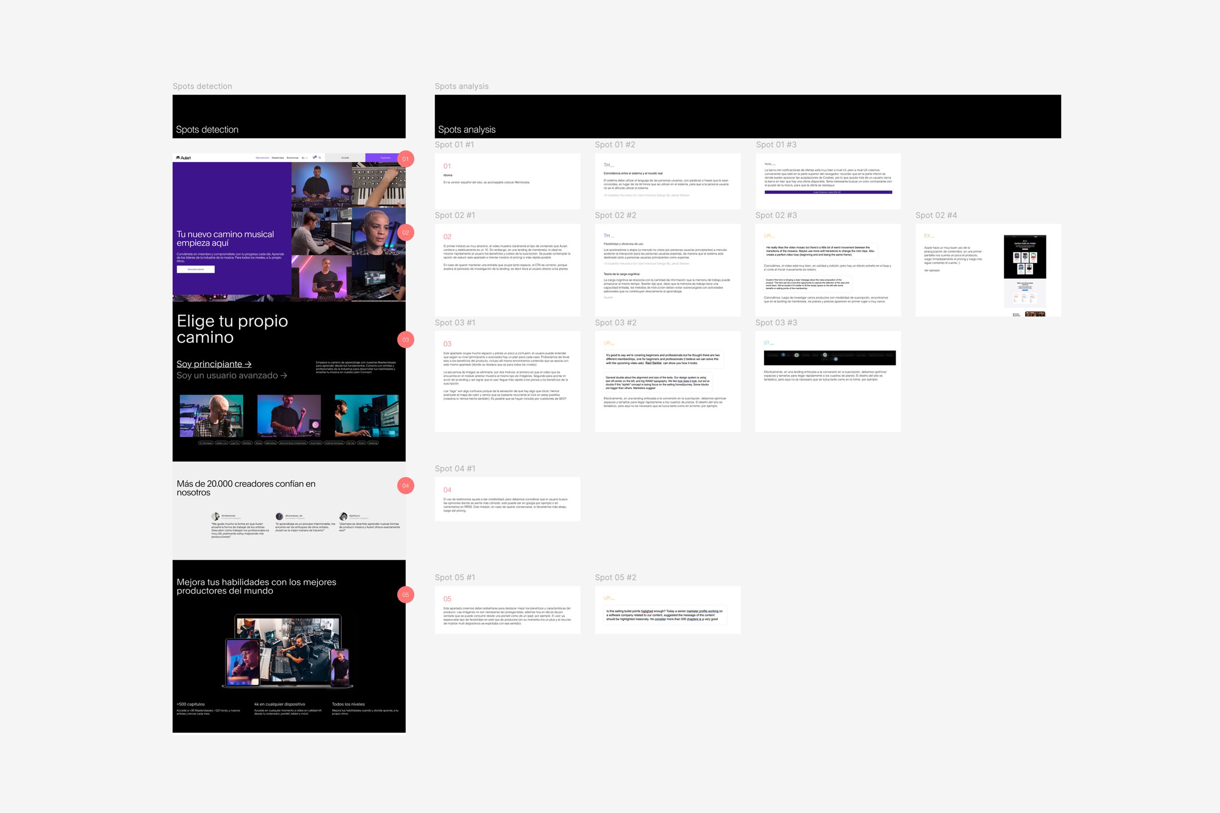
Heuristic evaluation
Define—State users’ and business needs and problems
Once the analysis is complete, we define the problems to be addressed:
-
Some words and terms confuse users about what they can find or do.
-
The benefits of membership are not immediately apparent.
-
The first impression is that Aulart is designed for professionals, when the reality is that you can benefit at all levels even if you've never interacted with music production.
-
In some cases the images do not reflect what is explained in the text.
-
The amount and diversity of content that can be accessed with membership is very broad, and users find themselves with a wealth of information.
-
The cost of membership is confusing for many users; the option to pay monthly but with an annual commitment makes them hesitate when making the decision.
-
Nearly 60% of users access the site via mobile, so the responsive version must be highly adapted.
Ideate—Challenge Assumptions and Create Ideas
After analysing user needs and considering costs and implementation possibilities, we have designed the following updates:
-
✓
Improved the copy to make it easier to understand. -
✓
Prioritise content so that membership benefits are clear and concise. -
✓
We emphasise that Aulart is for all levels, from beginner to advanced. -
✓
We redesigned the product cards and optimised the comparison so that users can easily understand the cost of the membership, payment options, and what's included in each case.
Solution—Final design
We have adjusted the design to meet the objectives and address the identified issues.
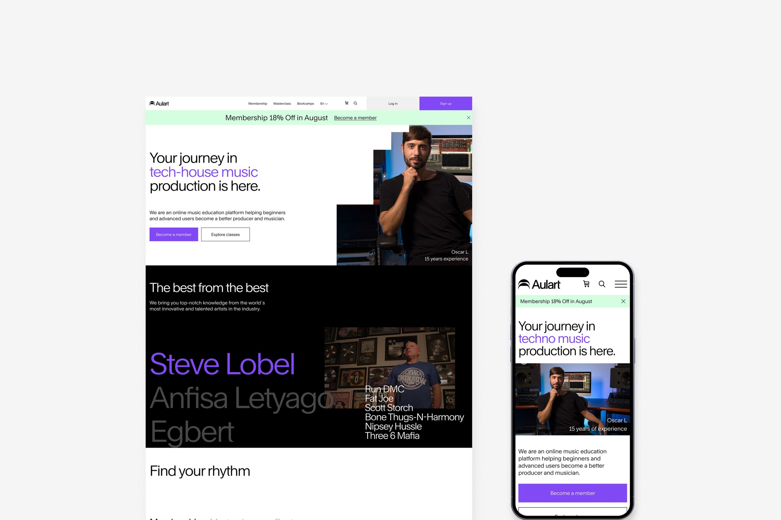
New homepage desktop and mobile
Homepage in detail
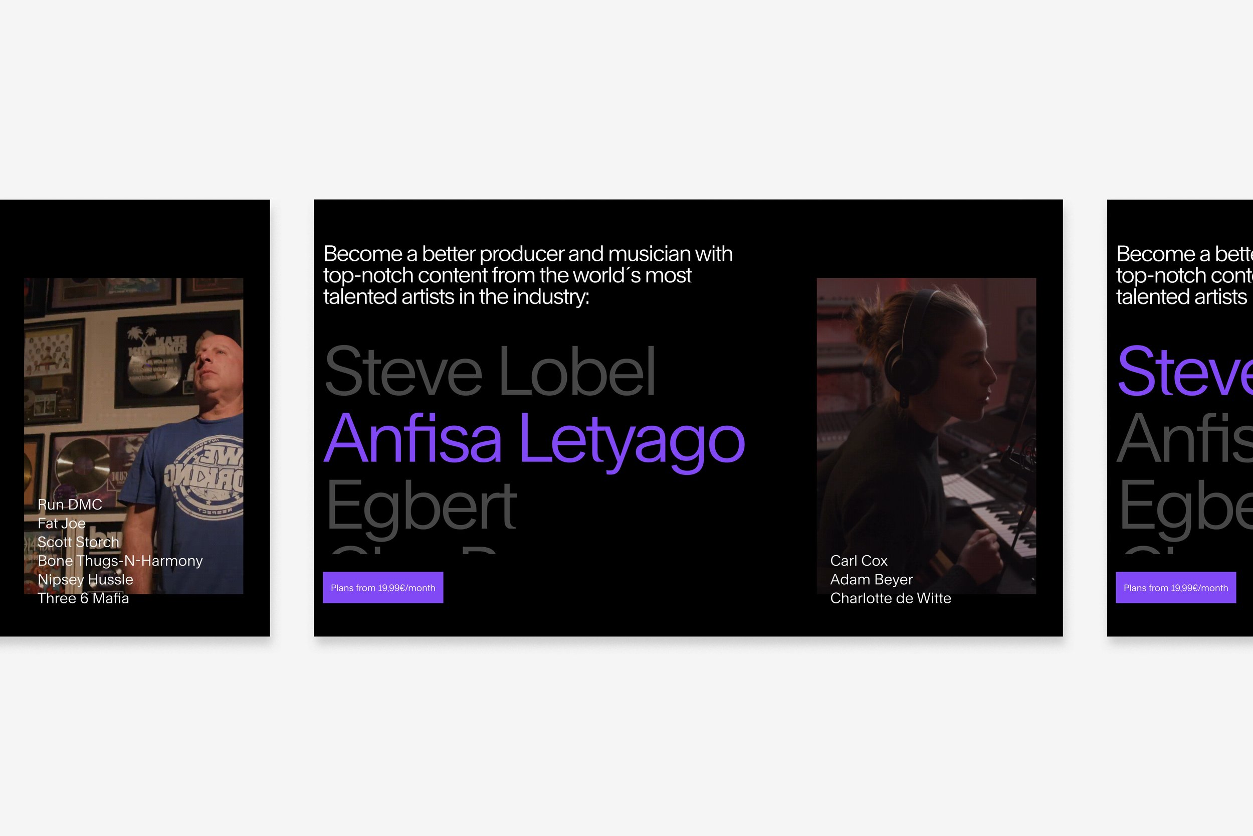
Animated slider to highlight top industry producers

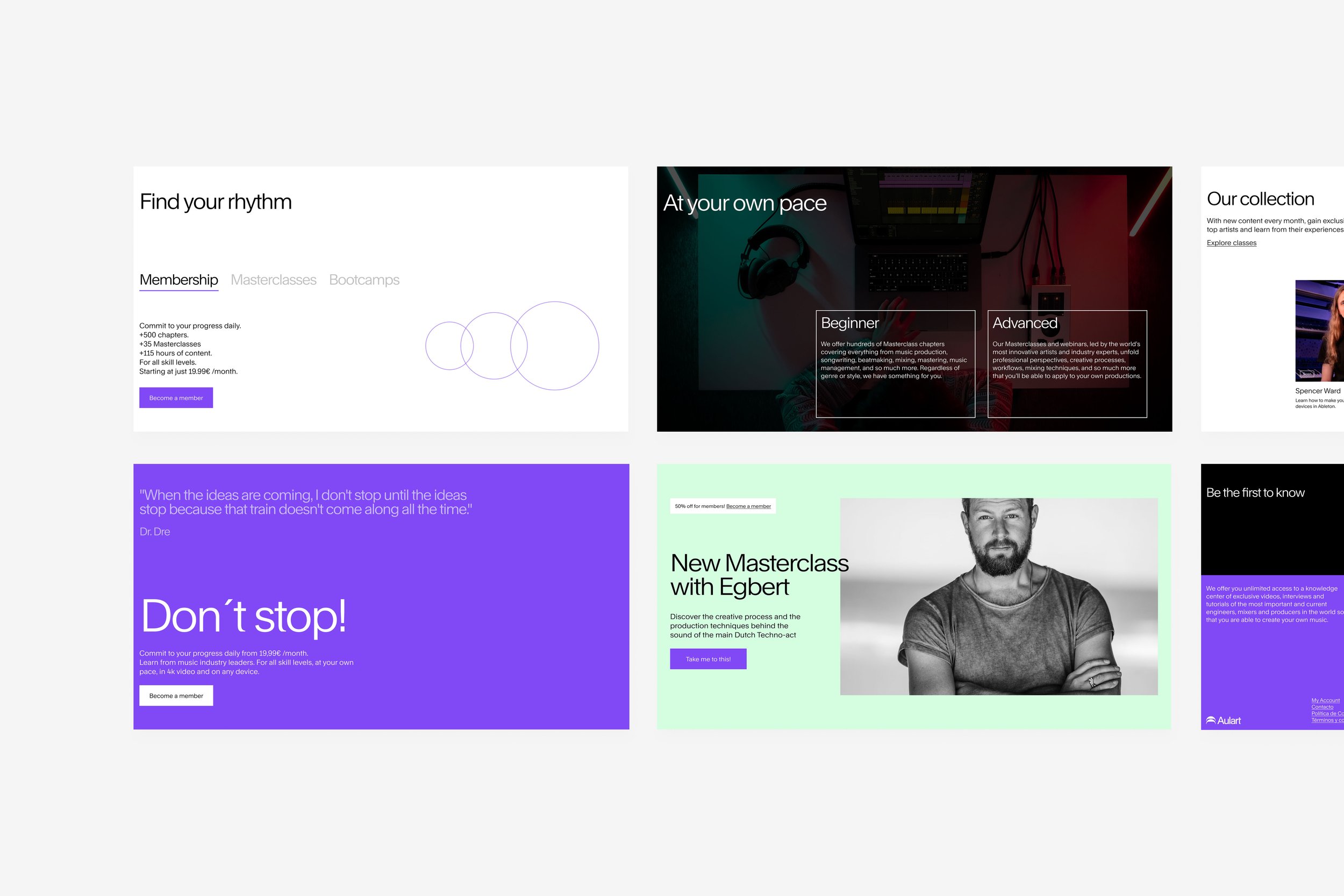
New membership page

New masterclasses grid

Responsive design
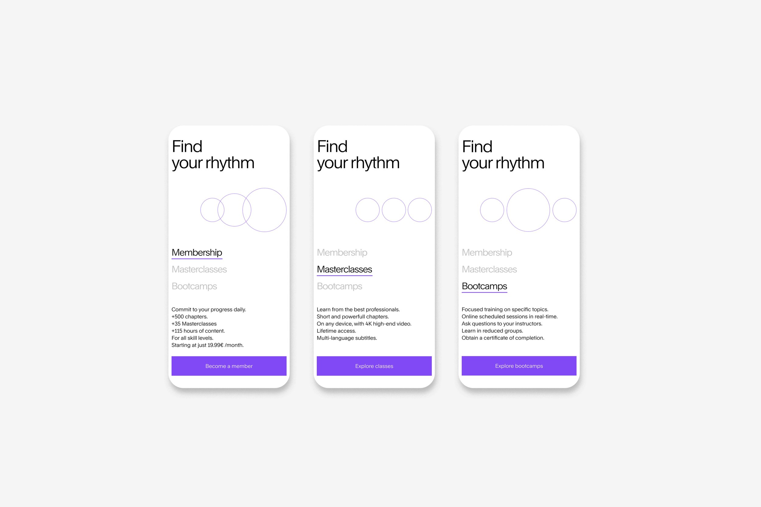
Responsive design

Responsive design

Responsive design
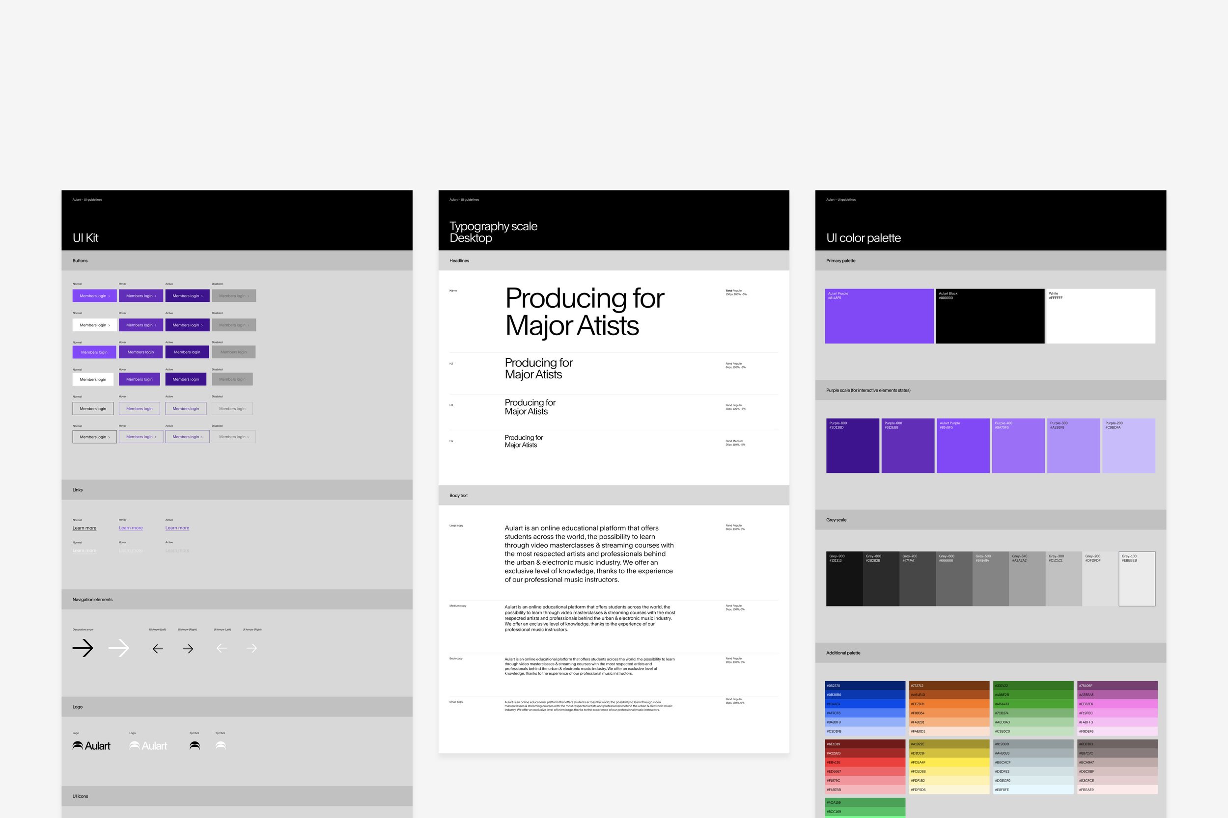
UI Kit reorganised for better usability

Detailed components and variants
What we have achieved
-
✓
The conversion rate has increased. -
✓
Users navigate in a more organised manner; heat maps show us that they click on content in a logical order. -
✓
Surveys show that prices and payment methods are clear. -
✓
Users who didn't identify with the product now see that they can access and learn even as beginners.
What we have not achieved yet
-
╳
Users still prefer monthly payments even though the commitment is annual. -
╳
Some users still find the content a bit confusing: classes, masterclasses, plugins, and bootcamps. -
╳
For some users, the added value of the Connect plan is not clear enough.
Conclusion
Aulart's product is very broad and varied; both beginners and advanced users can benefit from classes and memberships. When the audience is so diverse, it's a challenge to create an experience that delivers the right message to both audiences. The use of keywords and concise comparisons have helped organise the content better.
Next steps
The next step is to continue working in detail, using hard and soft data. The opinions of existing members who renew each year are key to understanding where they see value. Continuous improvement lies in providing clear information, both in terms of content and cost.
Note: due to information sensitivity, the data presented here is not 100% accurate, and several processes and screens are not displayed. If you'd like to learn more about this project and my approach, please don't hesitate to get in touch. Thank you.